- Print
- DarkLight
- PDF
The CashFlow User Interface
- Print
- DarkLight
- PDF
We’ve designed the CashFlow interface to be easy to use, and organized in a logical manner to match your workflow. This article will provide an overview of our user interface, and give some insight into how we arranged the app’s layout.
Menu Bar
In CashFlow, the Menu Bar is located at the top of every page. This is where you can quickly access the Projects page, or securely log out once you have completed your working session. You can also access the Account drop-down to update your profile or billing details.
Projects Page
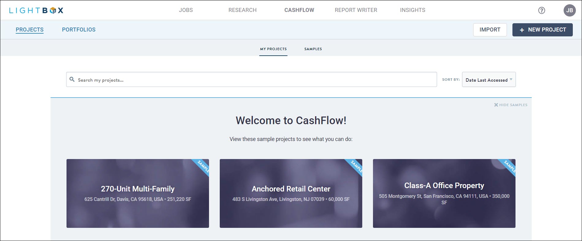
When you log in to CashFlow, you'll be greeted with the Projects menu. This is a hub for all of your projects, and is where you will create new projects or make copies of existing ones. Click on the New Project button to start building a deal, or if you have an existing project from a previous work session, click on it to open it.

Once you have opened a project, you’ll see the main components of the CashFlow user interface: the Tab Sidebar, Pages, the main Workspace, and the Menu Bar. We’ll take a closer look at each of these below.
Tab Sidebar
The main CashFlow Workspace is contextual, meaning its content will change depending on which tab you are currently working in. For example, opening the Assumptions tab and clicking on the Rent Roll page will reveal inputs for Rent Roll tenants and their related assumptions. It’s not too different than your web browser, where you navigate between multiple tabs and can visit different pages within each one.
Dashboard
Our first tab, the Dashboard, is a collection of key project information. Here you’ll find a map of your project, as well as critical real estate metrics and capitalization details. This information updates automatically as you make changes to your input assumptions.
Assumptions
The Assumptions tab is where all of the project inputs are located. Inputs are organized by category into Pages, and the pages are listed in a specific order that will minimize tedious back-and-forth page navigation. For example, you’ll see that the Market Leasing page is listed before the Rent Roll page. The logic here is that first you would create Market Leasing Profiles, and following that input Rent Roll leases which reference those Market Leasing Profiles. Having these pages in the right order streamlines the input process, and prevents the circular navigation that slows down your workflow.
Reports
Within the Reports tab is an array of presentation ready reports. Like the Dashboard, these reports dynamically update with your CashFlow model and always display the latest information. You’ll find industry standard reports such as an annual and monthly pro forma, a return summary, and an expiration schedule.
.png)

.png)