.png)
LightBox Live Glossary
- Print
- DarkLight
- PDF
LightBox Live Glossary
- Print
- DarkLight
- PDF
Article summary
Did you find this summary helpful?
Thank you for your feedback!
Caret Icon This is represented next to data in the form of an arrow pointing downwards. Selecting this will either expand or hide content. |
|
Filter Icon This icon provides options for users to narrow down the view of a dataset by specifying criteria (ex: date ranges). |
|
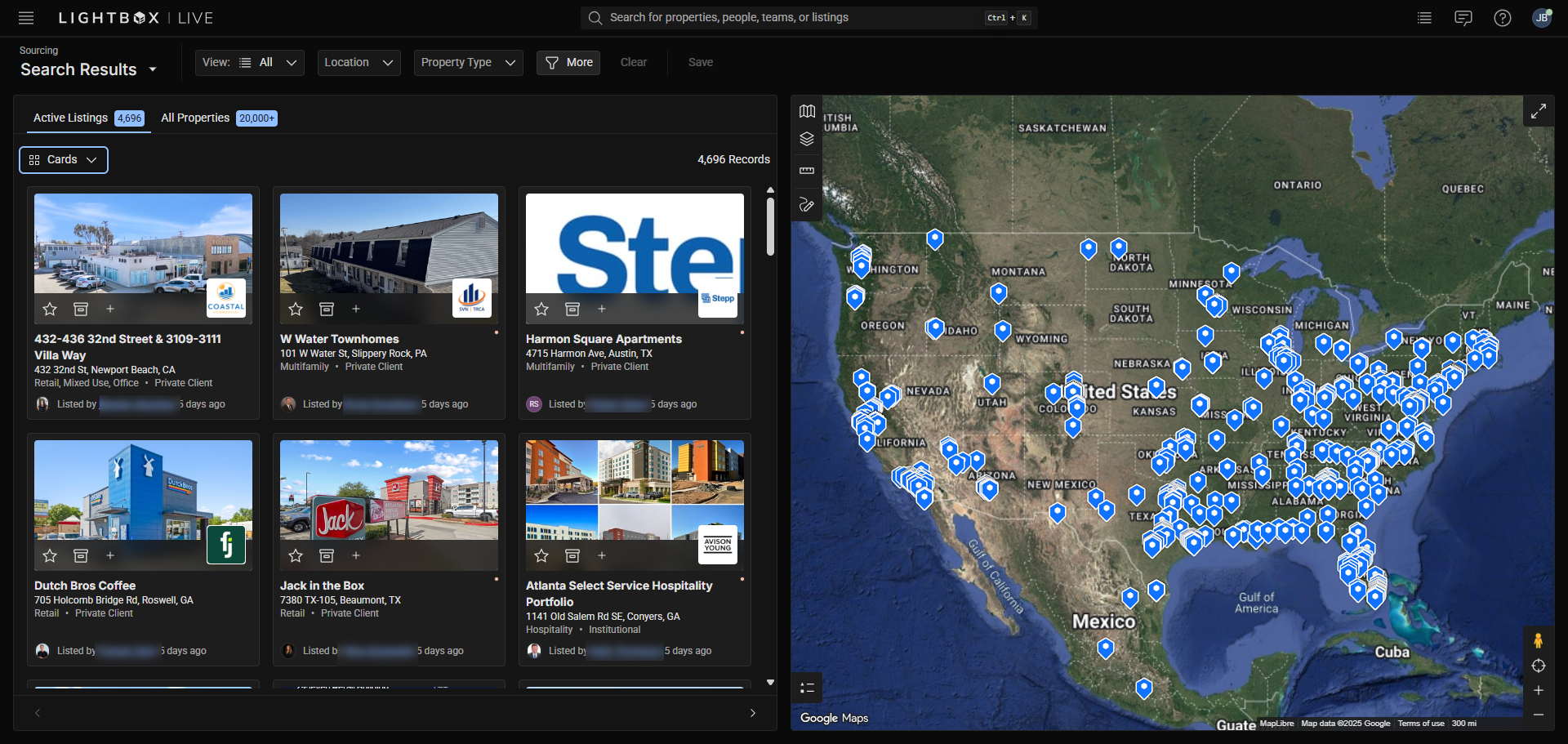
Home Page This is the default landing page that users will come in to, and is also considered the Sourcing Workspace. |
|
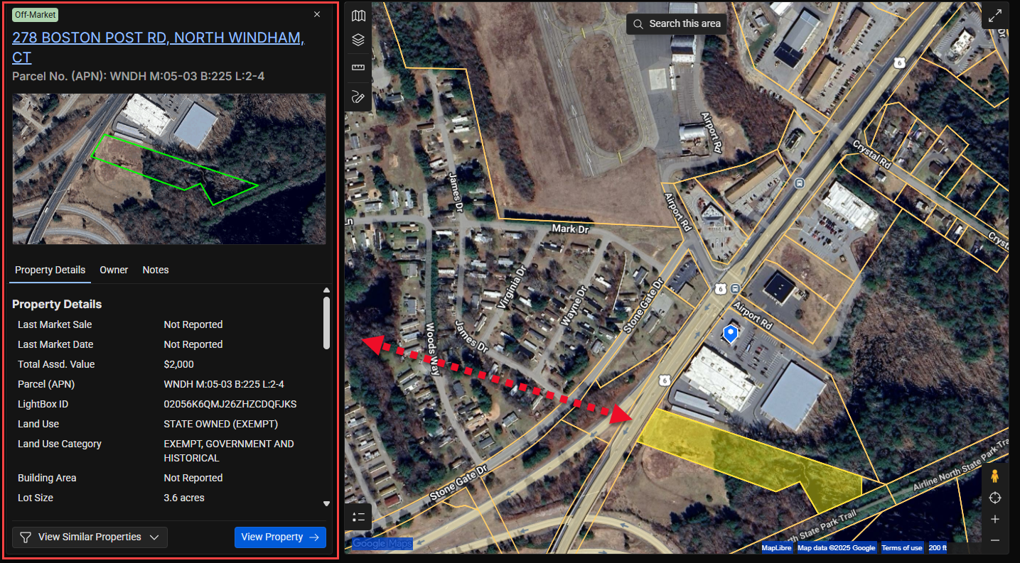
Layers Icon This icon can be found in most Map Components on the upper left corner. Each layer represents a different dataset that can be displayed on the map for visualization. For example: Enabling the True Owner layer will display blue points on top of properties in the Map Component that LightBox was able to acquire enhanced ownership information for. |
|
Preview Window This window displays a brief overview of information when certain points or polygons in a layers are selected within the Map Component. For example: Selecting a parcel boundary from the parcels layer will display some property information in this window. |
|
Recenter Icon This icon is represented by a target symbol and can be found on the bottom right corner of most Map Components. Clicking this will center the view of the map over the regional preferences that were selected during account setup. |
|
Search Bar At the top of LightBox Live will be a universal way to input a search by utilizing this text input bar. |
|
Parcels These are property boundaries represented as a layer called “Parcels,” which can be found on most Map Components in various Workspaces. Selecting the parcel outline will provide a Preview Window of property information. |
|
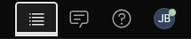
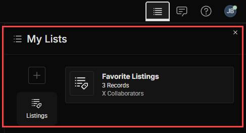
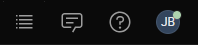
Tool Tray Located on the top right of LightBox Live, this offers a list of user options (Tools) to choose from. Tools can reference workspaces or launch you to one. If a Tool within the Tool Tray is selected, then it will display in a bold white active state and display a side Tool Panel underneath. |
In the example above, the left-most tool is active. |
Tool Panel Secondary content will appear under the Tool Tray when a Tool is selected, providing a preview of the Tool options. |
|
Tools Located as icons within the Tool Tray. These can be: like search, view messages, get help or change their profile information. |
|
Top Bar This consists of the entire set of options at the top of LightBox Live which encompasses the Workspace and Tool Trays as well as the Search bar. |
|
Workspace These are the primary areas within LightBox Live. Currently, there are two workspace options within the Workspace Tray:
Additional workspaces will be made available in the future, and some will be available as an add-on option for purchase. Workspace availability will depend on the “role” selected when users first log in and have purchased add-on workspaces. | |
Workspace Pages These display more detailed information found on the workspaces. Pages currently include Listings and Properties, with more planned for the future. The different pages can be found by accessing different sections within the Workspaces that contain a link to open a window to view detailed information within LightBox Live. |
.png)


Was this article helpful?
.png)