Map Layers
- Print
- DarkLight
- PDF
Map Layers
- Print
- DarkLight
- PDF
Article summary
Did you find this summary helpful?
Thank you for your feedback!
Layers are present across all map components in LightBox Live. This article summarizes available layers and provides helpful details for Investor Workspaces. A layer represents a specific dataset that can be shown as an overlay on a map. Some layers are interactive, allowing selection to retrieve a summary preview card of the data within that layer.
Note: For optimal performance, disable layers you do not need. Enabling more layers can affect performance due to increased processing time.
Parcels
The Parcels layer displays orange-colored parcel boundaries nationwide. When enabled, you can select a parcel to view the Property Detail panel. Boundary data is sourced from jurisdictions (such as counties or cities), typically updated annually when available. The following label options can be enabled for parcels:
Address Number
Address and Street
APN
Owner First Name
Owner Last Name
Opportunity Zones
Opportunity Zones are designated areas created by the Tax Cuts and Jobs Act of 2017, offering tax advantages for certain investments in lower income areas. In the Layers menu, these appear as polygons: green polygons represent low-income communities (LIC), and blue polygons represent non-LIC contiguous tracts adjacent to an LIC (with median family income ≤125% of the adjacent LIC).
Learn more: CDFI Fund – Opportunity Zones.

Points of Interest
The Points of Interest (POI) layer aggregates various icons reflecting what is available in Google Maps. This layer is not interactive; clicking POIs does not display additional information.
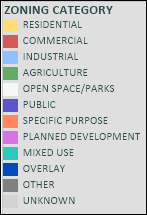
Zoning
The Zoning layer is a nationwide dataset that can be toggled on/off, along with a companion label layer that shows zoning codes and categories. LightBox actively sources updated zoning information from jurisdictions (counties, cities, or county subdivisions) across the U.S. as often as possible. The following label options can be enabled for Zoning:
Zoning Code
Zoning Category
Zoning Color Legend
Yellow = Residential zoning
Red = Commercial zoning
Light blue = Industrial zoning
Green = Agriculture zoning
White = Open space/parks zoning
Purple = Public zoning
Orange = Specific purpose zoning
Pink = Planned development zoning
Teal = Mixed use zoning
Dark gray = Other zoning
Light gray = Unknown zoning
Topography
This nationwide layer from the United States Geological Survey (USGS) displays contour lines that indicate elevation. It can assist in assessing hazard and climate risks and in identifying suitable areas for development or investment. This is a visual overlay that may cover the base map and other layers; enable it only as needed.
Reference: USGS Topographic Map Symbols.
Fault Lines
Provided by the USGS, this layer shows thick black lines representing earthquake fault lines. Use it to assess areas that may be at higher risk of earthquake damage.
Learn more: USGS – What is a fault?
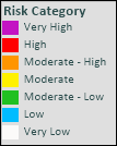
Earthquake Risk
USGS nationwide polygons visualize earthquake risk potential, categorized as follows:
Purple = Very high risk
Red = High risk
Orange = Moderate-high risk
Yellow = Moderate risk
Green = Moderate-low risk
Blue = Low risk
White = Very low risk
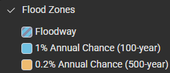
Flood Zones
The Flood Zones layer (from FEMA) highlights areas at risk of flooding. Floodways appear with striped visuals. Light blue shading indicates areas with a 1% annual chance of flooding (1 in 100). Beige/orange shading indicates moderate risk areas (0.2% annual chance, or 1 in 500).
Demographics
The Demographics dataset provides a comprehensive collection of census-based data aggregated by census geographies (see below). The dataset is sourced from a third-party vendor and is updated annually to ensure current information.
Commonly used demographic views—such as Population Density, Age, and Household Income—are available as preconfigured layers for quick access. Demographic attributes can also be queried using search and filtering tools.
Demographic data is aggregated at the census block group level.
Was this article helpful?